Thursday 29 August 2013

CheckBox and CheckboxList that look like Bootstrap buttons-checkbox

I really Like Bootstrap and I had the need for the Bootstrap buttons-checkbox see Figure 1 below but not being a client side genius Smile with tongue out and could not workout how I would get the selected values, and I like the use the right tool or the right job (i.e. Checkbox for Checkbox and Radio button for Radio button) So I looked around and found this article here Stuff you can do with the “Checkbox Hack” and I thought I can make that work for me Ninja

Bootstrap buttons-checkbox

Figure 1 – Bootstrap buttons-checkbox

So I made my own CSS (in LESS of course until I can get SASS) so here is the LESS source

// checkbox and rtadio button styles
.checkbox-buttons
{
// hide the checkbox/radio button
input[type=checkbox],
input[type=radio]
{
// hide checkbox
display: none;
}

// Default State
label
{
display: inline-block;
*display: inline;
padding: 6px 12px;
margin-bottom: 0;
*margin-left: .3em;
font-size: 14px;
line-height: 20px;
color: #7c7c7c;
text-align: center;
-webkit-text-shadow: 0 1px 1px rgba(255, 255, 255, 0.75);
text-shadow: 0 1px 1px rgba(255, 255, 255, 0.75);
vertical-align: middle;
cursor: pointer;
background-color: #f5f5f5;
*background-color: #e6e6e6;
background-image: linear-gradient(to bottom, #ffffff, #e6e6e6);
background-repeat: repeat-x;
border: 1px solid #cccccc;
*border: 0;
border-color: #e6e6e6 #e6e6e6 #bfbfbf;
border-color: rgba(0, 0, 0, 0.1) rgba(0, 0, 0, 0.1) rgba(0, 0, 0, 0.25);
border-bottom-color: #b3b3b3;
-webkit-box-shadow: inset 0 1px 0 rgba(255, 255, 255, 0.2), 0 1px 2px rgba(0, 0, 0, 0.05);
box-shadow: inset 0 1px 0 rgba(255, 255, 255, 0.2), 0 1px 2px rgba(0, 0, 0, 0.05);
font-weight: bolder;
}
// Toggled State
input[type=checkbox]:checked + label,
input[type=radio]:checked + label
{
color: #333333;
background: rgb(74, 238, 48);
*background-color: rgb(112, 255, 124);
//background: linear-gradient(top, #1e5799 0%, #7db9e8 100%);
//background: linear-gradient(to bottom, rgb(112, 255, 124), rgb(4, 212, 21));
-webkit-text-shadow: 0px 0px 6px rgba(255, 255, 255, 0.9);
text-shadow: 0px 0px 6px rgba(255, 255, 255, 0.9);
}
// Mouse over State
input[type=checkbox]:hover + label,
input[type=radio]:hover + label
{
-webkit-box-shadow: inset 2px 3px 2px #cccccc, 0 1px 6px rgba(255, 255, 255, 0.2);
box-shadow: inset 2px 3px 2px #cccccc, 0 1px 6px rgba(255, 255, 255, 0.2);
}
}

.with-border-radius
{
& > label:first-of-type
{
border-top-left-radius: 6px;
border-bottom-left-radius: 6px;
}

& > label:last-of-type
{
border-top-right-radius: 6px;
border-bottom-right-radius: 6px;
}
}

Listing 1 - checkbox-buttons and with-border-radius classes

So I have put it on NuGet here

Bootstrap buttons checkbox and radio buttons nuget package

Bootstrap buttons checkbox and radio buttons NuGet package

Use

Add the package to your project from NuGet

From the Package Manager Console type:
Install-Package NotAClue.Checkbox.Css.Buttons

It will add a Content folder to your project if it’s not already there with the checkbox-buttons LESS and CSS files add a reference to the min.css file to your master page and then decorate you CheckBoxes, CheckBoxLists, RadioButtons and RadioButtonLists with the “checkbox-buttons“ CSS class and if you want to have the ends of the buttons rounded add the “with-border-radius” CSS class. You will get the following:

checkbox-buttons-in-action

Figure 3 – Checkbox Buttons in action

In Figure 3 you will see I have made the selected style more differentiated than the on in Bootstrap, it’s just a matter of style and usability I have some none computer literate mobile users in mind and wanted to make it clear that they had set a value.

Download

Everything you need is on NuGet.

Wednesday 28 August 2013

Adding a simple BootstrapMenu to Dynamic Data With Bootstrap

We are going to add the new ASP.Net web forms BootstrapMenu control to a Dynamic Data project, I like to clean it up a little first.

clean project

Figure 1 – Clean project

So what I did to clean my project was to create a new Dynamic Data project and then remove the scripts folder and the RegisterScripts method and method call from the Global.asax.cs file. This will leave us with no Scripts (jQuery Modenizr etc.) in the project we are no ready to add the BootstrapMenu control.

open nuget

Figure – 2 Open NuGet

Next we search for NotAClue packages and scroll down to the last package

get bootstrap menu control

Figure 3 – Get bootstrap menu control

Click Install

installing bootstrap menu control

Figure 4 – Installing bootstrap menu control

bootstrap menu control installed

Figure 5 – Bootstrap menu control installed

Next we need to add the script and style sheet references.

adding the scripts and style sheets

Figure 6 – Adding the scripts and style sheets

Lets clean out the Default.aspx and it’s code behind file

Default.aspx file

Figure 7 – Default.aspx file

Default.aspx.cs file

Figure 8 – Default.aspx.cs file

Now we add the menu to the Site.master

Adding the bootstrap menu mark-up

Figure 9 – Adding the bootstrap menu mark-up

Adding the bootstrap menu code behind

Figure 10 – Adding the bootstrap menu code behind

So after all that here it is the first part of our Bootstrap Dynamic Data Project Template

Working Bootstrap Menu Control

Figure 11 – Working Bootstrap Menu Control

Download

As usual you can get the code from the Project on Bootstrap Friendly Control Adaptors and on my SkyDrive

Tuesday 27 August 2013

Bootstrap Friendly Web Controls

A big project rename after discovering that the Menu does not play well with Control Adapters and that this is not the way forward I have now renamed the project to Bootstrap Friendly Web Controls and I have added the first control which is the BootstrapMenu

bootstrap-freindly-logo

Bootstrap Friendly Web Controls is now Live on Codeplex  and NuGet

BootstrapMenu

Next I will create tutorial on using the BootstrapMenu control.

Wednesday 21 August 2013

GridView Bootstrap Update

It would appear that issue that pushed me towards using Control Adapters to fix my issues with the GridView were “Not entirely accurate” it seems that if you do the following to the default List pages we will get the GridView to perform as we wish with Bootstrap. Scott Hunter has a post here Cleaning up Default GridView Mark-up this showed me we can clean the mark-up up fully without resorting to Control Adapters.

Default GridView Mark-Up For Dynamic Data

Figure 1 – Default GridView Mark-Up For Dynamic Data

Going back to my original post Bootstrap Friendly Dynamic Data I showed the mark-up in Figure 2 and demonstrated this caused issues with Bootstrap and other CSS styles applied to the grid.

table mark-up Issues

Figure 2- Table mark-up issues

So we change the mark-up to that in Figure 3 and then we get this nicely cleaned mark-up in Figure 4

Updated GridView Mark-Up For Dynamic Data

Figure 3 – Updated GridView Mark-Up For Dynamic Data

table mark-up fixed

Figure 4 – table mark-up fixed

GridView output with Bootstrap

Figure 5 – GridView output with Bootstrap

Hope that helps

Download

As usual you can get the code from the Project on Bootstrap Friendly Control Adaptors and on my SkyDrive

Sunday 18 August 2013

Adding Validation Using Bootstrap Popover

I noticed an article by Damien Edwards called Updating the ASP.NET validator controls to change invalid control’s CSS class on non-JavaScript clients this got me thinking could I create an Control Adapter that would work for ALL Validators and would take advantage of the Bootstrap Tooltip or Popover JavaScript effects, Figure 1 is what I came up with.

Bootstrap Tooltip in action

Figure 1- Bootstrap Popover in action

So how did I do it, well I’m not entirely sure this is good practice, I’m using a Control Adapter to get the the Pre-Render event and then I get the the control as a BaseValidator get access to the ControlToValidate the about 30 lines of code and we have the above for any Validator.

protected override void OnPreRender(EventArgs e)
{
base.OnPreRender(e);

var validator = Control as BaseValidator;
var controlType = Control.GetType().ToString();
var stringType = controlType.Substring(controlType.LastIndexOf(".") + 1, controlType.Length - controlType.LastIndexOf(".") - 1);

// build unique CCS class per validator type
var validatorError = String.Format("{0}-{1}", stringType, ERROR_CLASS);
var controlToValidate = Control.NamingContainer.FindControl(validator.ControlToValidate) as WebControl;
if (controlToValidate != null)
{
if (validator.IsValid)
{
// remove validator class
var className = String.Join(" ", controlToValidate.CssClass.Split(' ').Where(c => !c.Equals(validatorError)).ToArray());
controlToValidate.CssClass = className;
}
else
{
// add validator class
if (controlToValidate.CssClass.Split(' ').FirstOrDefault(c => c.Equals(validatorError)) == null)
controlToValidate.CssClass = String.IsNullOrEmpty(controlToValidate.CssClass)
? validatorError
: String.Format("{0} {1}", controlToValidate.CssClass, validatorError);

// add tooltip
controlToValidate.Attributes.Add("data-placement", "right");
controlToValidate.Attributes.Add("data-toggle", "popover");
controlToValidate.Attributes.Add("data-trigger", "hover");
controlToValidate.Attributes.Add("data-delay", "500");

// add title
controlToValidate.Attributes.Add("data-original-title", "Error!");
//TODO: add append errors to tooltip
controlToValidate.Attributes.Add("data-content", validator.ErrorMessage);

//$(document).ready(function () { $("#test").tooltip(); });
var datePickerScript = String.Format("$(document).ready(function () {{ $('#{0}').popover(); }});\n", controlToValidate.ClientID);
Control.Page.AddStartupClientScript(controlToValidate.ClientID, datePickerScript);
}
}
}

Listing 1 – Control Adapter OnPreRender

This piece of code does it all it finds the control we are validating and then add the CSS class or removes it depending on it being valid or not.

.inner-glow (@radius: 3px, @color: #f3ffa7)
{
-webkit-box-shadow: 0 0 @radius @radius @color inset !important;
box-shadow: 0 0 @radius @radius @color inset !important;
}

.required
{
.inner-glow;
}

.RequiredFieldValidator-validation-error,
.RegularExpressionValidator-validation-error,
.CompareValidator-validation-error,
.CustomValidator-validation-error,
.RangeValidator-validation-error,
.DynamicValidator-validation-error
{
.inner-glow(2px, fadeout(#ff0000, 50%));
border: 1px solid fadeout(#ff0000, 40%) !important;
}

Listing 2 – LESS Classes

I did the the styling using LESS as it’s available readily now with Mads Kristensen’s Web Essentials for Visual Studios 2012 and 2013.

Note: I think in the long term I want to do what Damien Edwards said inn his post and create an updated Validator for each of the main validators and also do a custom Popover that can be styles independently of the Bootstrap one.

Download

As usual you can get the code from the Project on Bootstrap Friendly Control Adaptors and on my SkyDrive

Sunday 11 August 2013

Adding Some More Bootstrap Love to the Dynamic Data Project Template

In this article I want to add some of the nice features of Bootstrap to Dynamic Data

  • Bootstrap Navbar
  • Bootstrap Date Picker

Navbar

First of all we will move the list of table from the Default Page to the Site.master and have it as a menu in the nave bar.

Navbar

Figure 1 – the Navbar

All we need for this is to move the Page_Load from the Default.ascx.cs page to the code behind of the Site.master.cs and then add the mark-up the Site.master see the two pages below:

<div class="navbar">
<div class="navbar-inner">
<a class="brand" href="#">Dynamic Data</a>
<ul class="nav">
<li>
<asp:LinkButton ID="LinkButton1" runat="server" PostBackUrl="~/Default.aspx">Home</asp:LinkButton>
</li>
<asp:ListView ID="Menu1" runat="server">
<LayoutTemplate>
<li class="dropdown">
<a class="dropdown-toggle" data-toggle="dropdown" href="#">Tables&nbsp;<b class="caret"></b></a>
<ul class="dropdown-menu">
<li runat="server" id="itemPlaceholder"></li>
</ul>
</li>
</LayoutTemplate>
<ItemTemplate>
<li runat="server">
<asp:DynamicHyperLink ID="HyperLink1" runat="server"><%# Eval("DisplayName") %></asp:DynamicHyperLink>
</li>
</ItemTemplate>
</asp:ListView>
</ul>
</div>
</div>

Listing 1 – the Menu mark-up

protected void Page_Load(object sender, EventArgs e)
{
System.Collections.IList visibleTables = Global.DefaultModel.VisibleTables;
if (visibleTables.Count == 0)
{
throw new InvalidOperationException("There are no accessible tables...");
}
Menu1.DataSource = visibleTables;
Menu1.DataBind();
}

Listing 2 – the Page_Load moved to Site.master

Date Picker

Add the Bootstrap Date Picker using NuGet

Bootstrap Date Picker

Figure 2 – Bootstrap Date Picker

Then copy the DateTime and DateTime_Edit Field Templates and rename to Date and Date_Edit, then add a script and CSS references to the Site.master.

<div class="controls">
<div class="input-append date" id="DivDate" runat="server">
<div class="input-append">
<asp:TextBox
ID="TextBox1"
runat="server"
CssClass="input-small" />
<span class="add-on"><i class="icon-calendar"></i></span>
</div>
<asp:RequiredFieldValidator
runat="server"
ID="RequiredFieldValidator1"
CssClass=""
ControlToValidate="TextBox1"
Display="Static"
Enabled="false"/>
<asp:RegularExpressionValidator
runat="server"
ID="RegularExpressionValidator1"
CssClass=""
ControlToValidate="TextBox1"
Display="Static"
Enabled="false"/>
<asp:DynamicValidator
runat="server"
ID="DynamicValidator1"
CssClass=""
ControlToValidate="TextBox1"
Display="Static"/>
<asp:CustomValidator
runat="server"
ID="DateValidator"
CssClass=""
ControlToValidate="TextBox1"
Display="Static"
EnableClientScript="false"
Enabled="false"
OnServerValidate="DateValidator_ServerValidate"/>
</div>
</div>

Listing 3 – Date_Edit.ascs mark-up

// get default display format
var dateFormat = CultureInfo.CurrentCulture.DateTimeFormat.ShortDatePattern;

// create script
var datePickerScript = String.Format("$('#{0}').datepicker();", DivDate.ClientID);
Page.AddStartupClientScript(String.Format("{0}{1}BootstrapDatePicker", Table.Name, Column.Name), datePickerScript);

DivDate.Attributes.Add("data-date-format", dateFormat.ToLower());
TextBox1.Attributes.Add("placeholder", dateFormat);
TextBox1.ToolTip = Column.Description;

TextBox1.Columns = DateTime.Now.ToString(dateFormat).Length;

Listing 3 – Date_Edit.ascx.cs

Listings 2 & 3 show the necessary code to create the Date Field Templates

Bootstrap Date Picker in Action

Figure 3 – Bootstrap Date Picker in Action

The Project is on Bootstrap Friendly Control Adaptors and on my SkyDrive

Converting the Dynamic Data Project Template to Bootstrap

Next we will convert the rest of the standard Dynamic Data Project Templates to Bootstrap, this will required the us to deal with the following parts of Dynamic Data’s components.

  • Page & Entity Templates (Details, Edit & Insert)
  • Field Templates
  • Filters
  • Validation

Page and Entity Templates

If we look at the Edit page Figure 1 rendered you can see it has been rendered using a table

EditTemplate

Figure 1 – Edit Template (with border turned on)

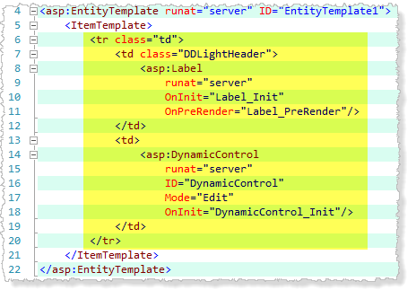
If we look at the mark-up we can see what we have to deal with, the FormView Edit template (Figure 2) it contains a Table with some cell padding next look at the Entity Template mark-up (Figure 3) we see each item will be rendered as a table row with the first cell having the label and the second having the field.

Edit Template mark-up

Figure 2 - Edit Template mark-up

Edit Entity Template mark-up

Figure 3 – Edit Entity Template mark-up

If we look at the Bootstrap Forms we see that forms have a layout that looks like similar to the output of the default templates the Horizontal Form this is what we will go for.

Edit Template mark-up Bootstrappified

Figure 4 – Edit Template mark-up Bootstrapified

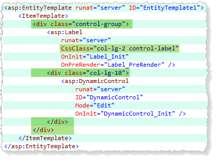
Edit Entity Template mark-up Bootstrappified

Figure 5 – Edit Entity Template mark-up Bootstrapified

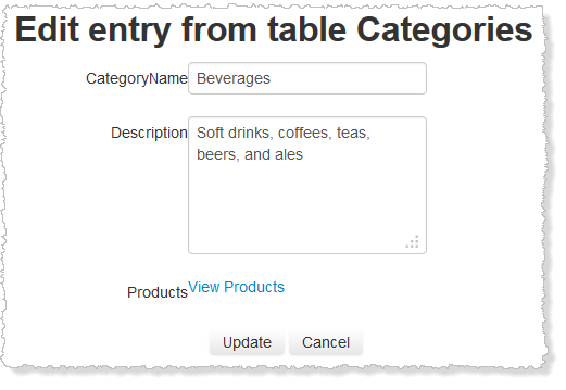
If you look at Figures 4 & 5 you can see all I have done is add the example mark-up in place of the table mark-up and you can see from Figure 6 that it has made the edit template look a little more like the Bootstrap Form. 

Note: you will need to do this in the Details, Edit and Insert Page Templates and in the three Default Entity Templates.

Edit Template Post Bootstrapifing

Figure 6 - Edit Template Post Bootstrapifing

To complete the transformation we will need to look at ALL the field templates.

Field Templates

Since Each field template is made up of other controls we will need to make sure the mark-up for each is configured to the Bootstrap mark-up. Take a look at the (Figure 7) Text_Edit Field Template.

Text_Edit Field Template

Figure 7 – Text_Edit Field Template

What we see here is typical of all Edit Field Templates we have the field control followed by the Validators since these exist in the page as spans so they need to be encapsulated otherwise they will push the format around and mess it up.

Validators Presence In mark-up

Figure 8 – Validators Presence In mark-up

ValidatorsPresenceMarkUp

Figure 9 – Validators Presence mark-up

As it turns out this is quite simple though long winded see Figure 10 this excerpt from the Bootstrap Forms (2.3.2) documentation.

Horizontal-Form

Figure 10 – Horizontal Form

Bootstrapified Edit Template With Field Templates

Figure 11 – Bootstrapified Edit Template with Field Templates

You can see from Figure 11 that adding the DIV with the controls class sorts the layout out nicely.

Updated: that the Details page template displays the field text out of line add the read-only-field to the div that surrounds all field templates to fix this. 
ReadOnlyCssClass ReadOnlyFields
 

Filters & Validation

I will tackle Filters and Validation together.

Validation & Filters in List Page Template

Figure 12 – Validation & Filters in List Page Template

To make the Validation show well with Bootstrap we need to look at the Alerts in Bootstrap, we will replace “DDValidator” class with the “alert alert-error” in all pages see Figure 13

Replace DDValidator with alerts

Figure 13 – Replace DDValidator with alerts

Then we remove the DIV from around the Validators and Filters see Figure 14 for the details, this ends up looking like this:

UpdatedValidationAndFilters

Figure 14 – Filters

And if we cause the validators to show, we now get a Bootstrap alert to show our errors.

ValidatorsShowing

Figure 15 – Validators showing

Next up adding a Menu and Navbar to the site.

The Project is on Bootstrap Friendly Control Adaptors and on my SkyDrive

Sunday 4 August 2013

Adding the a Bootstrap Pagination to the GridView Adapter

See Bootstrap Pagination

BootstrapPager#1

BootstrapPager#2

BootstrapPager#3

Figure 1 – Bootstrap Pager Styles 1, 2 & 3 from Bootstrap

The GridView has some setting that determine how the none template GridView pager is rendered (see Figure 2) here we have the usual settings. Looking at the Pager Mode PagerTypes in Figure 3 there are only four type we can select from these are shown in Figure 4, 2 – 4 1 is closer to what I like first previous next last with number in between and it’s this one I will use as my NumericFirstLast. Going back to Figure 2 we can see three areas we can get other customisation information from.

  1. PageButtonCount – the number of numeric buttons to show
  2. How the buttons will show i.e. the symbol or image for the first last next previous buttons, if there are no values here we will use the Glyphicons from Bootstrap.
  3. Position – this will indicate the position of the pager

Pager Settings In Visual Studio

Figure 2 – Pager Settings In Visual Studio

Pager Types---

Figure 3 – Pager Mode  PagerTypes

My Bootstrap Pagers

Figure – 4 My Bootstrap pager styles

If we look at what is currently rendered from the GridView Control adaptor we can learn what it’s doing

Default Pager Settings

Figure 5 – Default pager settings

BootstrapPagerSettings

Figure 6 – Bootstrap pager settings

In Figures 5 & 6 I have changed to default pager setting to some custom setting for Bootstrap this should look something like Figure 4 pager #4 if we look at what is rendered before we make changes to the control adaptor we see Figure 7 which is a DIV with a series of anchor tags (<a></a>) and a span tag indicating the selected item for Numbers.

Default Pager Output From Control Adaptor

Figure 7 – Default Pager Output From Control Adaptor

So in Figure 8 the default render code we see all it is doing is getting the series of controls inside the default pager which is inside an inner table the code just finds the innermost controls and renders them without the table.

Default Pager Render Code

Figure 8 – Default Pager Render Code

So we need to add the unordered-list and surround each hyper-link with an list element (LI) and indicate which item is currently active (that will be the span) and add the “active” class to the item to get that working.

Updated Pager Render Code

Figure 9 – Updated Pager Render Code

In Figure 9 we have added the unordered-list wrapper and also wrapped each anchor/hyper-link with an LI tag and added the active class for when an item is selected. There is no PagerStyles.PagerItemSelectedCssClass se we will have to hard code that. In Figure 10 we can see out finished Bootstrap pager.

Finished Pager

Figure 10 – Finished Pager

Note: You can also create you own custom pagers any way you want look at the default one that come with Dynamic Data for ideas.
You can find the download code in the usual folder on my SkyDrive and the source code is here Bootstrap Friendly Control Adaptors

Next I plan to finish up making this Dynamic Data Project Template ready for access via the Visual Studio Gallery.

!Important: This is not only for Dynamic Data it will add Bootstrap love to any .Net 4.x Web Application

Updated: Now On NuGet.org Bootstrap Friendly Control Adapters you will still need to change the CSS and Pagers etc. manually but as soon as I get the Project Template done you won’t need to.